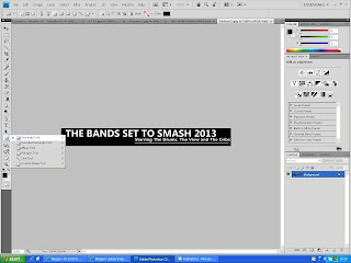
The image below shows my first masthead for my front page. I created this by using the shape "rectangle tool" in photoshop. I used layers to make the background black and the text white in order to fit with the house style and general colour scheme of my magazine. I left a space blank in the masthead in order for my logo to fit in with the masthead aswell. I used language such as "smash" as this will fit the genre of music my magazine focuses on but also will fit the style of language from my young audience. This is a form on downward convergence as my magazine deviates from standard english to suite my audience.

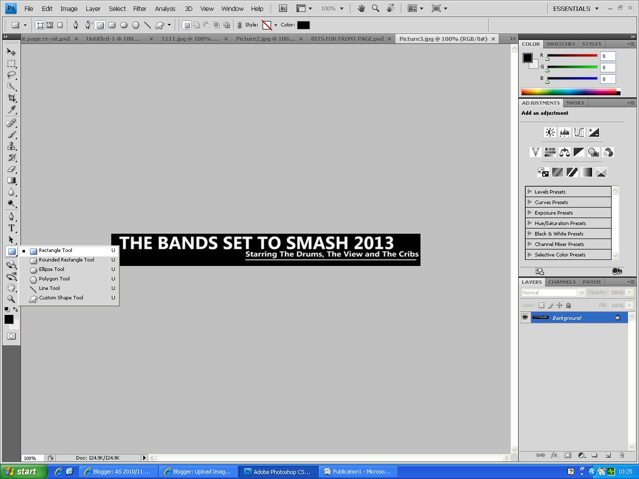
The image below also shows the feature I will use at the bottom of my front page. I found this was a general convention for music magazines especially NME as they display band names which will be included within the magazine. This attracts a specific audience of Indie/rock music fans. I also use the three colours red black and white as I found theses colours work well together in order to create an appealing, eye-catching front page. I also included the barcode as this is also a vital feature in professional music magazines in order for them to sell.


No comments:
Post a Comment